
Of course, that's just my humble opinion - and apparently, now that la princessa has turned four, my fashion opinion is irrelevant.
Our morning standardly looks like this: I take out a gorgeous floral jumper with coordinating shirt and tights which she promptly rejects in favor of her brown turtle-neck, navy skirt, and pink,grey,and white striped tights. Mortified, I personally bring her to gan making sure to engage the ganenet in conversation and "casually" mention that her ensemble was princess' choice and most certainly not mine.
She'll never be a fashionista and her future as an interior designer looks bleak but there is an element to her stubbornness (I mean, steadfastness) that I really enjoy. This is a kid who knows which color palette makes her happy.
The whole topic of color stands at the very center of good interior design.
When you approach interior design, you likely do so in a couple of different ways - choosing objects and colors that simply look attractive or using an existing pattern or theme to dictate your decisions. Both are fine (and safe) ways to infuse color into your home. However, color is a powerful tool that can be used to inspire emotions or simply set the mood and atmosphere for any particular room.
Of course, your feelings about color can also be deeply personal and are often rooted in your own experience or culture. Still, research does show that we all share some basic responses to color.
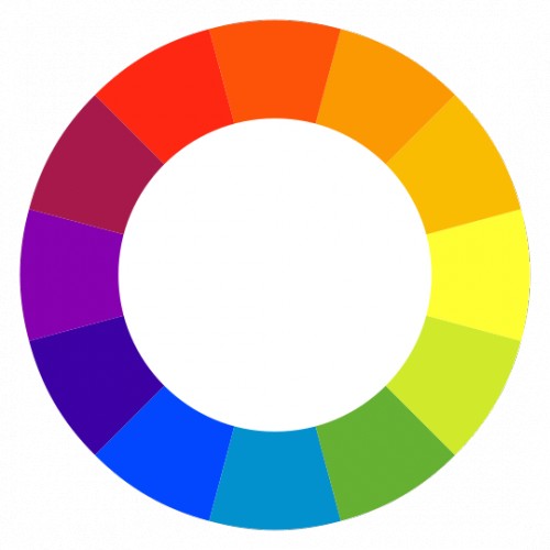
There are commonly noted psychological effects of color as it relates to two main categories: warm and cool.
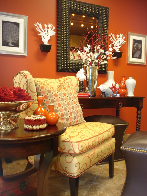
The reds, oranges, and yellows of the color wheel are referred to as the warm colors. These colors create more adrenaline which causes your blood pressure to rise. This increases your heart rate which increases your body temperature. Of course, the more saturated the color, the greater the effect. Warm colors can spark a variety of emotions ranging from comfort and warmth to hostility and anger.
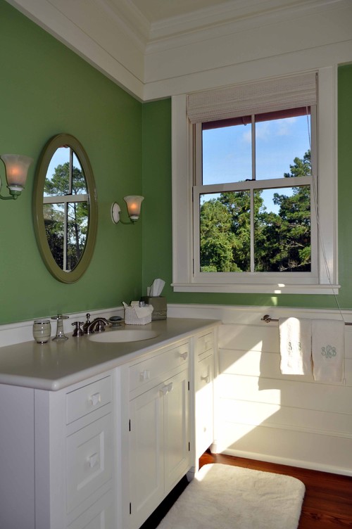
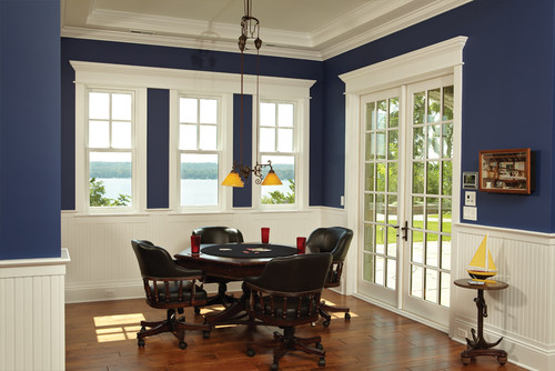
On the other side of the color wheel, greens and blues- are referred to as the cool colors. They are said to make us feel cool by slowing our heartbeat, relaxing our muscles, and lowering our body temperature. Cool colors often spark feelings of calmness and tranquillity.
On the other side of the color wheel, greens and blues- are referred to as the cool colors. They are said to make us feel cool by slowing our heartbeat, relaxing our muscles, and lowering our body temperature. Cool colors often spark feelings of calmness and tranquillity.
Here is a short list of commonly observed associations with specific colors. Notice if any of these associations ring true for you as well:
Red: love, warmth, excitement, and passion. Red is a color that increases enthusiasm and motivates to action.

Light Blue: health, tranquillity, calmness

Dark Blue: stability, trust, integrity, and power.
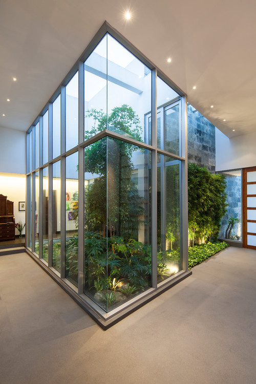
Green: rest, relaxation, nature, growth, freshness. Green is soothing and restful on the eye.
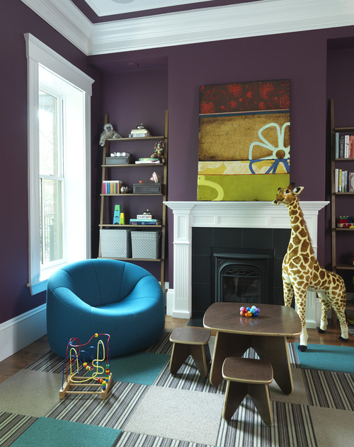
Purple: tranquillity, opulence, and wisdom. Because it appears so rarely in nature, purple can sometimes feel artificial or exotic.
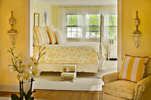
Yellow: Cheerfulness and sunshine. However, in its most saturated form, yellow is most likely to cause eye strain and is prone to make babies cry.
Brown: wholesomeness and practicality, orderliness, grounded with a connection to Earth.

Color is a massive topic which goes way beyond the scope of one post. Next time we'll see how color is used in interior design to effect desired responses - not that color psychology is a tool used by interior designers alone. Color psychology plays a prominent role in marketing and branding specifically. Yep, We're all playing with your mind.
One day many years ago, when my husband was on army reserve duty, I painted our bedroom dark purple (a similar purple to that in the room pictured above).
ReplyDeleteIt had been difficult to convince my husband that walls could be magnolia or cream rather than white which is why I was decorating while he was away.
Originally I had intended to treat the purple with a pale wash, to lighten it, but I loved the colour so much I couldn't bear to.
When my husband got home he was less shocked than I expected and didn't complain. I thought he was simply happy because I was happy.
And even after a couple of years I would break into smiles every time I entered the room such was the positive effect of that colour on my mood.
Now we are moving to a new apartment and one of my husband's first comments when we discussed decorating - 'You must paint our new bedroom purple.'
My daughter (and her entire day school) have taken on the "hobo" look. Skirt or dress over pants/leggings with unmatched shirt. Hair parted, pulled in a low pony, which just kills me since I love her hair out of her eyes and with accessories:) Trying to learn to let go. At least I let her make more decisions in design, her interior choices are less messy than her dressing!
ReplyDeleteHappy to find a new blog. Aliyah blogs and design blogs are my faves, so this is the perfect combination!
Jessica